Style Guide / 2026
Interior Design in Canada: The 2026 Style Guide
What defines the Canadian interior right now: the materials replacing grey, the proportions that work in our homes, and the decade of design decisions worth leaving behind.
Canadian interior design has always been caught between references. Too cold for the bleached-linen warmth of Californian interiors. Too modest for the maximalism of New York apartments. Too urban for the Nordic farmhouse aesthetics that keep appearing on Canadian Pinterest boards. The result, at its best, is something pragmatic and quietly confident: rooms that are warm without being rustic, modern without being cold, and above all, built for how people actually live in a country with six months of winter.
In 2026, that confidence is becoming more deliberate. A decade of grey walls, white oak, and photogenic minimalism is giving way to something more layered. Not heavier, not louder: more honest. Rooms that use natural materials for their actual qualities, not their look. Palettes built for artificial light. Furniture chosen for longevity rather than trend alignment. This guide covers what that shift looks like in practice, room by room and material by material.
From Performance to Substance
Between roughly 2013 and 2022, Canadian interiors were shaped by a single dominant aesthetic: the open-plan, light-flooded, grey-and-white interior. The look was coherent, aspirational, and extremely photographable. It was also, in many cases, not particularly livable. Bleached wood floors that showed every footprint. White kitchens that looked immaculate in listing photos and were a daily maintenance burden. Sofas upholstered in light-coloured performance fabrics that performed for two years and looked tired by year three.
The shift happening now is not a style change. It is a values change. Homeowners are buying fewer pieces and spending more per piece. They are choosing materials that age with character rather than materials that photograph well at delivery. They are designing for how they actually use their homes rather than how the homes would look on a real estate listing. The practical consequence of this shift shows up in three places: materials, colour, and proportion.
2013 to 2022
- Bleached white oak and light pine
- Grey walls, cool whites, the "greige" decade
- Open shelving as decoration
- Industrial accents in domestic rooms
- The fiddle leaf fig
- Statement pendant, no secondary lighting
- The matching furniture set
- Upholstery chosen by colour first
2026
- Darker wood: walnut, wenge, oiled ash
- Warm whites, terracotta, deep green, cognac
- Closed storage, fewer display surfaces
- Residential materials in residential rooms
- Sculptural ceramics and organic stone
- Layered lighting: floor, table, task, pendant
- Deliberate mixing of periods and materials
- Upholstery chosen by construction first
What the Shift Feels Like to the Touch
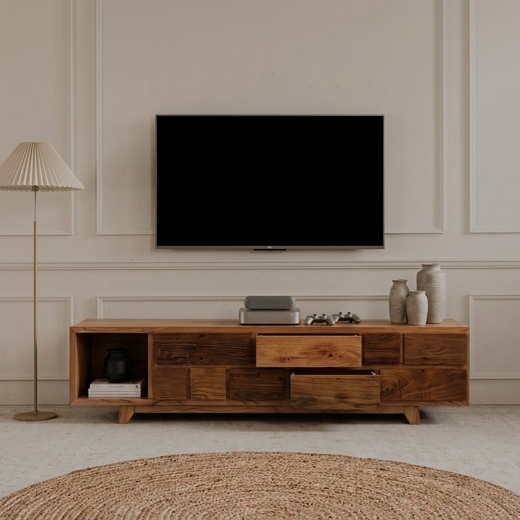
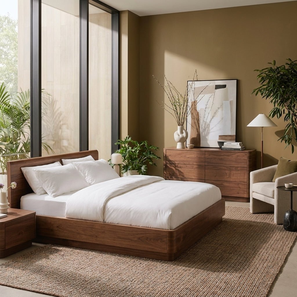
The 2026 Canadian interior is defined more clearly by its materials than by any colour palette or spatial arrangement. Natural materials are not new to interior design. What is new is the specificity: not "natural materials" as a trend statement, but specific materials chosen for specific reasons, used in rooms where their actual properties matter.

Aarhus Cloud Sofa / Natural linen blend, solid oak frame, stain resistant. Available from 120 to 360cm wide.
Darker tones returning after a decade of bleached oak. Walnut, wenge-veneer, oiled ash. Visible grain and knot character over engineered uniformity.
The fabrics that look better at year five than at delivery. Not because of trend but because natural fibre upholstery develops a surface that synthetic fabrics cannot replicate.
Replacing ceramic tile and lacquered MDF in tabletop applications. Scratch, heat, and moisture resistance without the brittleness of marble or the weight of granite.
Returning after a decade of fabric dominance. The patina argument: top-grain leather looks better at year ten than at year one. Budget performance fabric does the reverse.
Plant-based, finer surface than wool, responds to light differently at different times of day. The premium rug material choice for rooms where light quality is a design consideration.
Brushed bronze, aged brass, and matte black replacing the polished chrome of the previous decade. Warmer. Less formally modern. Pairs with wood rather than competing with it.
What Makes a Material Worth Choosing
The question worth asking before any material decision is not "does this look good now?" It is "what does this look like in five years?" Sintered stone looks the same. Top-grain leather looks better. Bleached pine laminate looks worse. Boucle develops a surface. Performance microfibre in a light colour shows wear, compression, and pilling. The aesthetic difference between materials at delivery is far smaller than the difference at year five. The decision is almost always about longevity, not appearance.
What's Replacing Grey
Grey dominated Canadian interiors for a decade because it was safe. It paired with almost everything, photographed cleanly, and offended no one. It also produced rooms that were, in many cases, quietly depressing, particularly in winter, when a cool-grey room with cool northern light and a grey exterior is its own particular Canadian aesthetic problem. The replacement is not colour maximalism. It is warmth, applied with more confidence than the grey decade allowed.

Adana Sideboard / Dark stained walnut veneer, corduroy door fronts, metal base. 221cm wide.
The 2026 Colour Story
Warm white over cool white. The distinction sounds minor and matters considerably in practice. A warm white (think a faint cream or off-white with yellow or pink undertones) holds artificial light and reads as a colour in its own right. A cool white (blue or grey undertones) amplifies northern winter light in a way that often reads as clinical rather than airy. If you are repainting a room that feels cold, switching from a cool white to a warm white will do more than any furniture change.
Terracotta and clay, done differently. The terracotta of 2019 was loud and specific. The terracotta of 2026 is more muted: a clay-toned linen on a bedroom headboard, a warm ochre on a single wall in a living room, a terracotta cushion against a walnut sideboard. Used as an accent on a large upholstered surface rather than as a wall colour, it reads as considered rather than trend-driven. The reason it works as an upholstery choice is that the linen or bouclé texture that carries the colour makes the tone visible in a different way at different light levels: warmer in the evening, more specific in morning light.
Deep greens. Forest green, sage, and moss are appearing in Canadian kitchens, bathrooms, and living rooms as the statement colour of 2026. The appeal is straightforward: greens at this depth read as organic without reading as earthy, and they work in both warm-palette rooms (beside terracotta and cognac) and cool-palette rooms (beside slate and indigo). The practical note: deep colours on cabinetry are more durable than on walls, because cabinetry paint is more washable and chip-resistant.
Indigo and deep blue. Not navy (too preppy), not royal blue (too saturated): indigo. A deep, slightly greyish blue that holds warmth at low light levels. The CBC's coverage of the 2026 Interior Design Show in Toronto identified indigo as the signature Canadian colour of the year, which tracks with what designers across the country are prescribing for rooms that need a focal point without a loud colour statement.
The Canadian Light Problem
Most interior design advice is written for rooms with abundant natural light. Most Canadian rooms, for six months of the year, do not have abundant natural light. Toronto gets fewer than nine hours of daylight in December. Calgary and Edmonton get seven. Halifax gets eight. Winnipeg gets eight hours of daylight in December and temperatures that make opening a window to increase light inadvisable. This is not a minor caveat in a design guide for Canadian homes. It is a central variable around which the whole thing needs to be designed.
Average daylight in a Canadian city in January. For more than half the year, Canadian homes operate primarily under artificial light. Designing for how a room looks in daylight is designing for the wrong condition.
National Research Council Canada · Solar data, 2025The practical implications for design are significant. Warm-toned materials hold artificial light better than cool ones. A room with warm-white walls, a walnut coffee table, and a terracotta accent will look rich and settled at 7pm in January. The same room with cool-grey walls, white oak, and chrome accents will look flat. This is not a subjective aesthetic preference; it is a property of how warm light (incandescent and warm LED sources) interacts with surfaces of different colour temperature.
Layered Lighting, Not Just Better Bulbs
The most common lighting mistake in Canadian homes is a single overhead source in each room, typically a flush-mount fixture or a pendant. A single overhead source creates one pool of light that, at low wattage, reads as dim and, at high wattage, reads as harsh. Neither is a useful condition for a room that is occupied for five to seven hours of artificial-light evening.
The correct approach is lighting at multiple heights: a pendant or semi-flush at ceiling level for ambient fill, a floor lamp in a reading corner, table lamps on sideboards and consoles, and task lighting wherever functional use occurs. The different heights create different zones of light intensity that make a room readable in the evening without the uniform brightness of an office. The specific bulb temperature matters: 2700K is the warm residential standard, 3000K is slightly cooler and acceptable in kitchens and bathrooms, 4000K is daylight-balanced and appropriate only where colour accuracy is a priority.

Antwerp Modern Floor Lamp / Matte carbon steel, opaline frosted glass, step-less foot dimmer, 360-degree pivot. 158cm height.
What a Good Floor Lamp Actually Does
A floor lamp positioned in a reading corner does more than provide task light. At the right height and angle, it creates a secondary pool of warm light that makes the rest of the room read as lived-in rather than dim. The opaline frosted glass shade is significant here: it diffuses the bulb completely, so what reaches the room is soft, ambient light rather than a directed beam. Step-less dimmers matter because the difference between 100% and 70% lamp output changes the register of a room entirely, and finding the right level for a Tuesday evening versus a dinner party is something you want to be able to do without replacing bulbs or fittings.
Reflective Surfaces, Used Deliberately
Reflective surfaces move light around a room and create the visual impression of more space. Mirrors, lacquered surfaces, brushed metal, and polished stone all contribute to this. The trap is overuse: a room lined with mirrors and metallic surfaces reads as restless rather than bright. The useful application is strategic: a large mirror on a wall that receives no direct window light, positioned to reflect the room's main light source. A brushed metal table base that catches floor lamp glow. A lacquered cabinet front that reads the wall opposite back into the room.
Scale for Canadian Homes
Canadian residential architecture produces two dominant home typologies in 2026: the urban condo (500 to 1,100 square feet, open plan, often with 9-foot or higher ceilings in new builds) and the detached or semi-detached house (1,200 to 2,500 square feet, typically with separate formal and informal living areas). The design challenges of these two typologies are almost completely different, and advice that is correct for one is often counterproductive for the other.
The Condo
In a condo living room, the sofa is usually doing more work than it is designed to do. It is the divider between the living zone and the kitchen. It is the primary seating for guests who would otherwise sit at the dining table. It is often visible from the front door, the kitchen, and the bedroom. For this reason, scale matters more in a condo than in a house: a sofa that is slightly too large crowds the room in a way that a house absorbs more readily, and a sofa that is too small fails to define a living zone in an open plan that needs definition.
The right approach for a condo living room: one sofa of correct length (usually 200 to 225cm for a space under 400 square feet), a rug large enough that the sofa's front legs rest on it, and one accent chair rather than a second sofa. The chair can be moved to the dining area for dinner parties, which increases the functional range of both pieces. The coffee table should be round or square and in the smaller end of its range; a 90cm round table reads correctly against a 210cm sofa in a way that a 150 by 80cm rectangular table often does not in a smaller room.
The House
House living rooms suffer from the opposite problem: too much furniture relative to how the room is actually used, arranged in a way that optimises for a television wall rather than for conversation or reading. The typical Canadian house living room has a sofa facing the television, two chairs flanking it, a coffee table in front, and enough residual space to move around, but no sense of a room that is about anything other than the screen.
The remedy is not removing furniture; it is reorienting it. A sectional or two sofas arranged to face each other, with the television as a secondary rather than primary focal point. A reading corner with a floor lamp and a good chair, positioned independently from the main seating group. Furniture that defines zones within the room rather than furniture that all faces the same wall. This requires more thought than the standard arrangement and produces a room that is visually richer and more functionally flexible.
Clearance Reference
Allow at least 90cm between any two pieces of furniture you need to walk between. Allow 45 to 60cm between a sofa and a coffee table. Allow 120cm between the coffee table and the television wall if traffic passes through that space. The minimum living room footprint for a full sofa-rug-table arrangement is approximately 380 by 380cm. Below that, a loveseat and accent chair is a more livable solution than a three-seater.
How a Room Settles
The defining quality of a well-designed room is not that every piece is expensive or that the palette is perfectly coordinated. It is that the room has a consistent internal logic: a reason why the pieces are together that is legible to anyone who walks in, even if they cannot articulate what that reason is.
That logic is built from three things. First, material temperature: warm materials (wood, warm linen, terracotta, leather) and cool materials (chrome, concrete, cool stone, grey fabric) create different emotional registers, and a room that mixes them without intention reads as unresolved. Second, scale consistency: pieces that sit at similar heights produce a visual horizon that gives the room a sense of settledness. Varying scale for effect is legitimate; varying it accidentally is not. Third, palette restraint: three tones in a room read as designed, five read as busy, seven read as a collection of separate decisions rather than a room.

Amadora Chaise / Umber velvet, asymmetric sculptural form, flared steel legs. The piece that finishes a room.

Albi Curved Sofa / Imported wool, high-resilience foam, engineered wood frame. 230cm wide.
The practical test: stand at the doorway to a room and look at it as a whole. If you can see the decision-making (the palette, the material register, the scale relationships), it is working. If you see the individual pieces without a sense of how they relate, the room needs editing, not adding. Most rooms reach the point they are looking for by removing something rather than purchasing something.
This runs counter to the way most people approach interior design, which is as a series of purchases. It also runs counter to the way most furniture is marketed, which presupposes that the solution to an unsatisfying room is a new piece of furniture. In a significant number of cases, the solution is putting two things in storage and letting what remains breathe.
One Useful Heuristic
If you are buying a new piece of furniture for a room and cannot clearly articulate what problem it is solving, do not buy it yet. Not because restraint is a virtue in itself, but because furniture that enters a room without a clear function tends to become background, and background furniture is the primary source of the cluttered, unsettled quality that rooms accumulate over time without any single obvious mistake being made. Every piece in a room should be the right piece. If it is the second-best piece because the right piece costs more, wait for the right piece. A room with five pieces that all belong is better than a room with nine pieces, four of which are placeholders.
Furniture Built for Canadian Homes
Free shipping across Canada on every piece. Natural materials, honest construction, and proportions that work in how we actually live.
Browse the Collection